Apple
Photography doesn’t always do the color of tech products justice, and my first thought when I wandered into the demo environment was that the new HomePod mini looks better in person than I expected. The pink is still paler than I’d like, but that’s okay and the green is undeniably chic. Even the most seemingly boring options, black and white and dark blue, work in a real-world context in a way that they don’t on a web page with a white background.
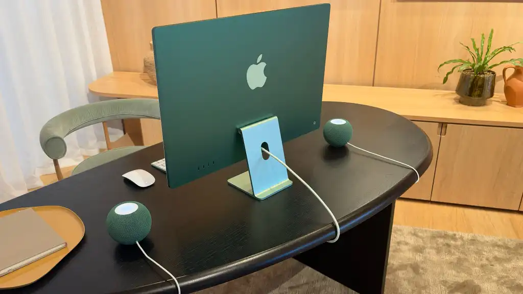
The real revelation, however, came when the product manager showed me a pair of green stereo HomePods that had been installed on either side of a green iMac. The new models, he casually mentioned, were the same color as the company’s famously attractive all-in-one desktop.
Good. Of course.
Now, it’s important to emphasize that this doesn’t mean that the two sets of products are in all cases exactly the same shade (although the greens are remarkably similar, as you can see above). It also doesn’t mean that the two ranges align perfectly; There is no black iMac, while the HomePod mini range does not have a purple option and, as mentioned above, no longer includes orange or yellow. Basically what we mean is that the green, blue, and pink HomePods will pair very well with the green, blue, and pink iMacs.
Apple
The thing is, when colors are offered in both products, they have been explicitly and consciously designed to match harmoniously. This has not always been the case. The bright orange and yellow HomePods, for example, were not (at least in my subjective opinion) a good match for the orange and yellow iMacs, because they are different interpretations of those colors. The orange HomePod isn’t peachy enough and the yellow HomePod too orange to work well with their counterparts. And both are too bold to match the iMac’s softer colors.
In other words, while the new colors may not be as exciting as the last set, they are more considered and much more coordinated. And in this type of technology, that counts.